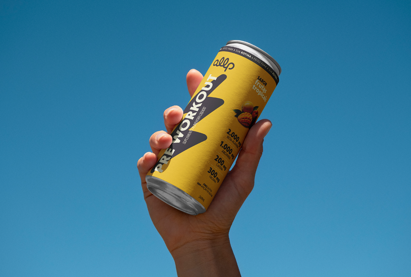
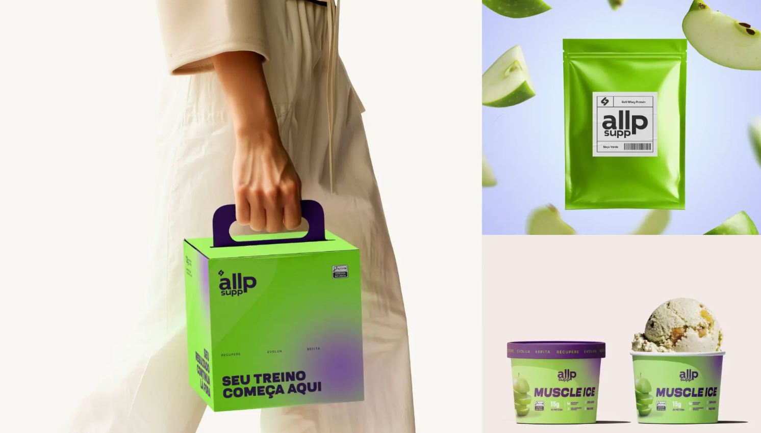
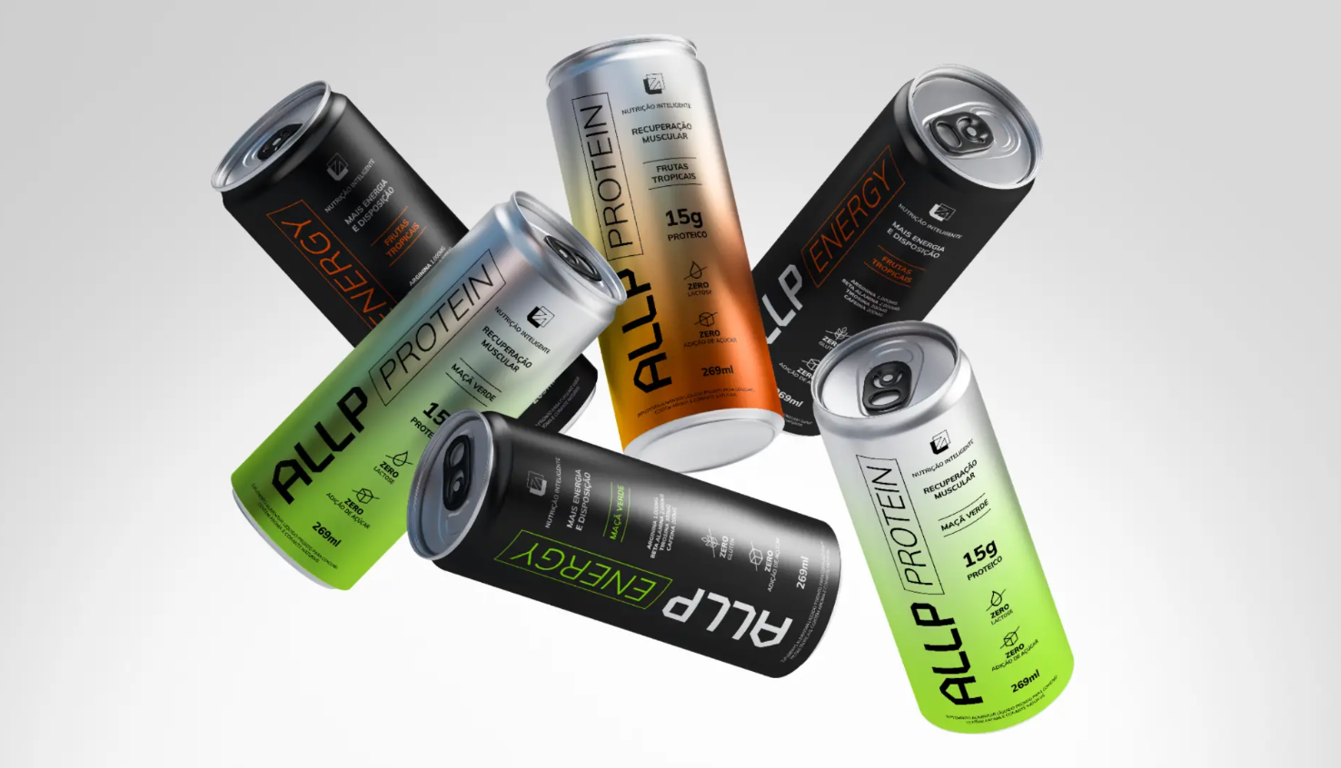
Allp Supp — Rebranding & Packaging
Strategic repositioning, visual identity evolution and a new packaging system for the sports nutrition portfolio.
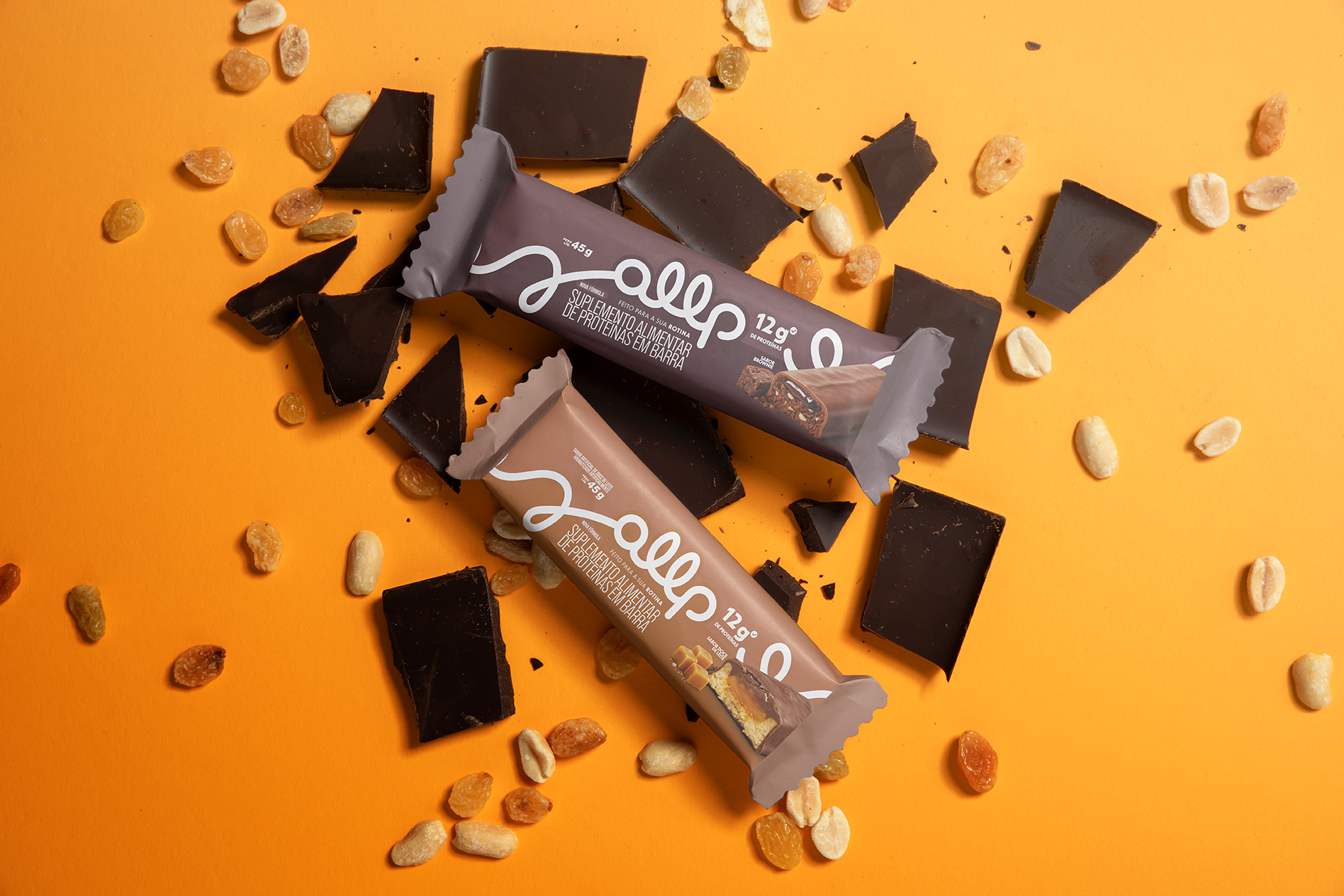
Brand Strategy · Positioning · Rebranding · Visual Identity · Storytelling
Allp Supplements is the nutrition and supplementation brand within the Allp ecosystem. The project focused on repositioning the brand beyond the traditional fitness supplement category, building a more distinctive proposition around convenience, lifestyle and accessible high performance.
The strategic process combined market and trend research, competitor analysis, consumer behavior, positioning mapping and SWOT analysis to identify opportunities for differentiation. The research highlighted a shift toward functional, on-the-go products and a consumer increasingly driven by convenience, portability and formats that integrate naturally into everyday routines.
This led to a new value proposition: nutrition designed to adapt to people's lives rather than requiring people to adapt their lives to supplementation. The brand was repositioned around practicality, health and freedom — connecting functional nutritional benefits with the emotional value of gaining time, balance and fluidity throughout the day.
Brand Concept — Top to All
The new positioning was translated into the concept “Top to All” — elite nutrition made accessible to everyone.
“Top” represents quality, performance and a pharmaceutical-grade standard, while “All” expands the brand beyond the traditional bodybuilding niche toward a broader community of people seeking better nutrition within real, dynamic routines.
This thinking also informed the simplification of Allp Supplements to Allp, creating a shorter, more contemporary and recognizable brand architecture.
Creative Direction
The new creative territory was built around a Clean & Power approach: a cleaner and more confident visual system combined with bold messaging, strong typography and a flexible graphic language designed to perform across packaging, retail, digital communication and lifestyle content.
The identity positions Allp as an on-the-go nutrition brand, balancing technical credibility with an approachable, energetic and contemporary personality.
The resulting brand system connects product innovation, communication and experience under a single idea:
Viva no seu ritmo.
Performance is no longer presented as restriction or sacrifice, but as something that can coexist with work, movement, pleasure and everyday life.
Allp — Smart nutrition. On your time. Your way.
Visual Index